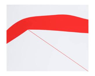
My Pretty Pony (Artists and Writers Series 6)
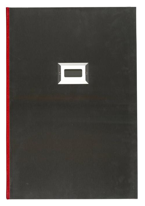


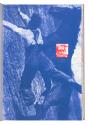

My Pretty Pony (Artists and Writers Series 6)
Artist
Barbara Kruger
(American, born 1945)
Author
Stephen King
(American, born 1947)
Date1988
DimensionsPage: 20 x 13 1/2 in. (50.8 x 34.3 cm)
MediumOriginal prints: 9 lithographs (1 with screenprint) and 8 screenprints in red, blue, and black (typeface: Helvetica italic)
Text: letterpress (typeface: Century Schoolbook)
Paper: Arches cream wove paper
ClassificationBooks
Credit LineMolly and Walter Bareiss Art Fund
Object number
1989.109
Not on View


Membership
Become a TMA member today
Support TMA
Help support the TMA mission