Advanced Search

My Pretty Pony (Artists and Writers Series 6)

My Pretty Pony (Artists and Writers Series 6)

Artist: Barbara Kruger (American, born 1945)
Publisher: Library Fellows of the Whitney Museum of American Art, New York, 1988 (May Castleberry)
Printer: lilthographs: Derrière l'Étoile Studios, New York (Maurice Sánchez and James Miller) screenprints: Pinwheel Studios, New York te
Binder: BookLab, Austin, Texas (Craig Jensen)
Author: Stephen King (American, born 1947)
Date: 1988
Dimensions:
Page: 20 x 13 1/2 in. (50.8 x 34.3 cm)
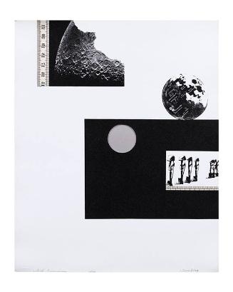
Medium: Original prints: 9 lithographs (1 with screenprint) and 8 screenprints in red, blue, and black (typeface: Helvetica italic) Text: letterpress (typeface: Century Schoolbook) Paper: Arches cream wove paper
Classification: Books
Credit Line: Molly and Walter Bareiss Art Fund
Object number: 1989.109
Label Text:Best known for her large poster-like images and text panels, Barbara Kruger was chosen by the Whitney Museum of American Art in 1987 to contribute to their series of artist's books. It was Kruger's idea to entice writer Stephen King to join the project. He agreed and sent an unpublished short story.

Kruger designed the entire book, including the binding of leather, cloth, and stainless steel with a digital clock embedded in the cover. The clock refers to King's story about an old man who tells his grandson the meaning of time and the different types of time. For her images, Kruger used a limited palette of red, black, and white to intensify the power of her artistic statement. The large size of the book is also an important component of Kruger's design. The three words of the title are printed so large you have to turn the page to read it. This interesting use of the physical book plays with and prolongs the time being explained in the story.


Barbara Kruger, My Pretty Pony. Text by Stephen King (1988)

My Pretty Pony is the 6th book in the Artists and Writers Series published by the Whitney Museum of American Art. For each of these limited-edition books, May Castleberry, the editor of the series, chose an American artist and an American author to collaborate. In 1987, Castleberry chose Barbara Kruger, best known for her large images and text panels. Kruger uses a limited palette of red, black, and white to intensify the power of her artistic statement. It was Kruger’s idea to entice the writer Stephen King to join the project. Surprisingly, he agreed and sent an unpublished short story.

Kruger designed the entire book, including the binding of leather, cloth, and stainless steel with a digital clock embedded in the cover. The clock refers to King’s story about an old man who tells his grandson the meaning of time and the different types of time. The large size of the book is also an important component of Kruger’s design. The three words of the title are printed so large you have to turn the page to read it. This interesting use of the physical book plays with and prolongs the time being explained in the story.
Not on view
In Collection(s)