Dlia golosa
Artist: El Lissitzky (Russian, 1890-1941)
Publisher: R.S.F.S.R. Gosiudarstvennoe Izdatel’stvo (Gosizdat), Berlin, 1923
Printer: Lutze & Vogt GmbH, Berlin
Author: Vladimir Mayakovsky (Maïakovski) (Russian, 1893--1930)
Date: 1923
Dimensions:
Book: H: 7 3/8 in. (188 mm); W: 5 1/4 in. (134 mm); Depth: 1/4 in. (7 mm).
Page: H: 7 3/8 in. (187 mm); W: 5 3/16 in. (131 mm).
Medium: Original prints: 14 typographic designs and printer's ornaments in black and red, printed letterpress with the text on cream wove paper (incl. wrapper).
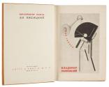
Reproduction: photolithograph of a lithograph on coated cream wove paper (title page).
Text: letterpress in black and red on cream wove paper.
Classification: Books
Credit Line: Gift of Molly and Walter Bareiss
Object number: 1984.681
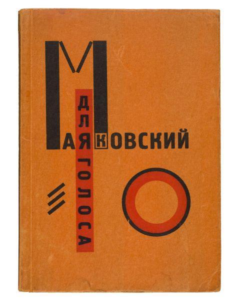
Label Text:Mayakovsky's thirteen poems were intended to be read aloud, hence the title "For the Voice." This book is an outstanding example of constructivists art applied to typographic design. Lissitsky's dynamic arrangement of letters, words, and type elements, coupled with his bold use of two-color printing, forms an exciting visual equivalent to the poems --even to one who does not read Russian. The ingenious thumb-index design visually unites the book's content in a unique way and helps the reader find, at a glance, a favorite poem.
El Lissitzky, Dlia Golosa (For the Voice). Text by Vladimir Vladimirovich Mayakovsky (1923)
Nicolai Kupreianov, [Gosplan Literatury. Literaturnyi Tsentr Konstruktivistov. Stat’i stikhi] (State Plan for Literature. Literary Center of the Constructivists. Essays, Poetry). Texts by various authors (1924?)
These two Russian Constructivist books were published near the end of Lenin’s lifetime. In Russia this was a period of great experimentation and accomplishment in the literary and visual arts.
Dlia Golosa literally means For the Voice, but might better be translated as For Reading out Loud. The text consists of 13 poems by the Russian poet Mayakovsky, whose fame was like that of a rock star today. The Russian people loved him and loved to hear his poems read out loud. When Mayakovsky asked Lissitzky to illustrate this group of poems, the artist designed a modest volume in black, white, and red. This small book would revolutionize type and graphic design. Ingenious tabs run down the right edge with symbols not only to locate but also to represent the 13 poems inside. Mayakovsky’s words are beautifully, visually composed across each page. Lissitzky believed that “concepts should be expressed with the greatest economy—optically not phonetically,” and that “the layout of the text on the page must reflect the rhythm of the content.”
Nicolai Kupreianov designed both the cover and the typography for Gosplan Literatury. It is an anthology of Constructivist texts by a dozen authors, published by the Literary Center of Constructivists (known as the LTsK). Like Lissitzky’s books, Gosplan has unusual divisions within the texts, including sections on perspective, production, “the laboratory,” and LTsK news. The book’s modest size and inexpensive materials are typical of the period. In the 1960s American artists used similar means for mass distribution of their books.
Not on view
In Collection(s)


